Guodong Cheng
1. Moodle in the Past: A Student’s Perspective
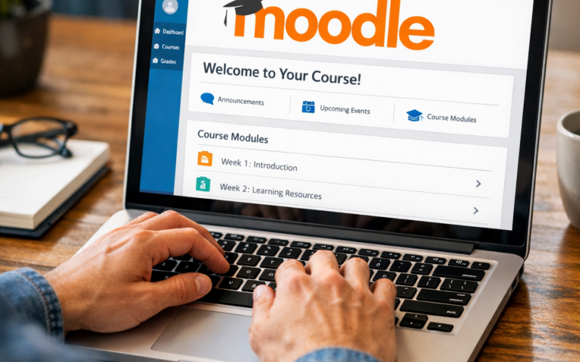
I’d like to begin this reflection not as a teacher, but as an international student who arrived in the UK twelve years ago. At the time, I had little experience using digital platforms like Moodle. I still remember the moment I first logged in: I was immediately overwhelmed by the information on the screen. To be clear, the module page was helpful, full of teaching and reading materials, and it was obvious that the lecturer had invested a great deal of effort into it. But like many (especially international) students, I didn’t know where to start, what to do next and when to do it (Laurence, Monica, & Leikny, 2014). But most importantly, it was not engaging. It felt more like a repository than a meaningful part of the learning journey.
2. Moodle Now: More Than a Repository
Over the past twelve years, we have made significant progress with the development of technology, especially the Virtual Learning Environment (VLE) such as Moodle, Blackboard, etc. However, the underlying logic remains the same: it is simply a platform for uploading resources and collecting assignments. But I see it differently. I see Moodle as a valuable opportunity to spark curiosity, build connections, and support diverse students. So when I had the chance to design my first Moodle site, I turned to my past self twelve years ago and asked: what could have been done differently to make it more engaging?
2.1 Tell a story
Every module has a good story to tell, and students want to understand how academic ideas connect to the world around them, including pop culture and real-life events. For instance, my module focuses on the ethical and legal implications of business analytics, a theme also explored in the popular TV series Black Mirror. I used that connection to structure the Moodle site (e.g., the title image) and organised weekly topics around the most relevant episodes. This immediately made my site stand out, and many students actually watched the episode ahead of the class, which made them more interested in this topic and therefore more engaged (Tao & Yang, 2025).
2.2 Assessment
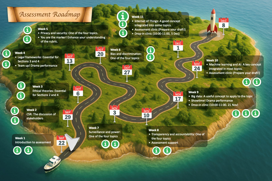
When designing the Moodle site, the first question I asked myself was: if I were a student, what would I want to know first? The answer was simple: how to succeed in this module! Three questions follow: What are the important deadlines? How do weekly topics contribute to the final assessment? What support is available? In the past, this information might have been scattered across multiple sections. Thanks to the H5P function, all of these can be effectively integrated into a single roadmap, featuring clickable hotspots and hyperlinks (see Figure 1). This roadmap includes:
Special hotspots in Weeks 9 and 11 that allow students to book 1-to-1 support (the number of sessions may change due to policy).
- A short summary with 2–3 bullet points on each week’s key messages and deadlines
- A clickable hotspot with links to a short recap or preview videos
- Another hotspot which reveals information on how each topic links to the assessment
- Special hotspots in Weeks 9 and 11 that allow students to book 1-to-1 support (which may change due to policy)
You may notice that in Week 1, there is a map pin to indicate our current location on this journey. This is updated on a weekly basis. This makes all the resources accessible in one place, and more importantly, it provides a clear sense of progression, in an engaging way.
2.3 Student-centred navigation
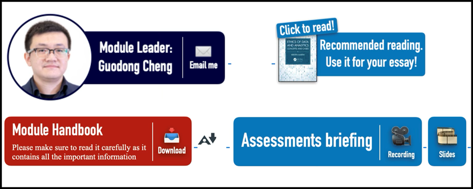
Beyond assessments, students often require quick access to other essential information, such as how to contact their tutor and where to find key resources (e.g., Module Handbook, textbook). Built upon the good practices from other modules, my solution is a “Spotlight area” (Figure 2) at the top of the page. Here I further visualise the information using icons and coloured bars, making this the hub for essential information.
The next section is the weekly materials. Many lecturers upload all weekly files to one list, and this can quickly become overwhelming. Some lecturers categorise them into different sub-sections, which is really helpful. Based on this, I adopted a colour-coded and emoji-supported framework to categorise all the information into “Three Circles” (Figure 3): teaching, research, and employability.
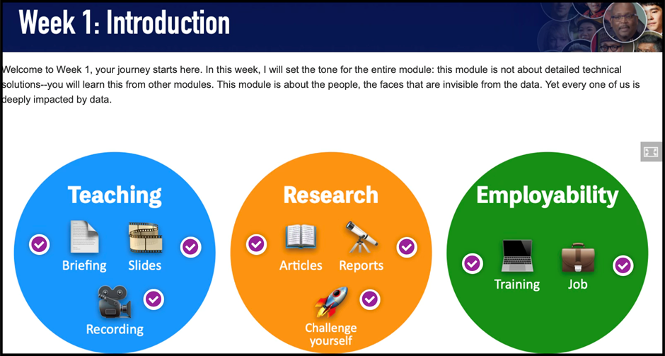
Similar to the roadmap, students can simply click the hotspot to reveal a set of documents. This not only keeps the page visually clean but also allows students to locate the resource at a glance.
3. Some final thoughts
I had the honour of sharing my Moodle design experiences at the 2025 Learning and Teaching Festival (LTF), where it received the “Next-Level Learning Design” award. While I appreciated the recognition, what I valued most was the feedback from my colleagues, especially around the challenges of my approach.
3.1 Have I gone too far?
Well, I have provided very detailed information on the assessment and on the weekly topics. But is this necessarily a good thing? The term “expertise reversal” effect suggests that the effectiveness of instructional techniques depends on the prior knowledge of the learner, and some of these techniques can even be counterproductive (Kalyuga et al. 2003). Therefore, should we provide all the information, step by step, to the students? This is particularly the case for assessments: where to draw the boundary of providing information to foster active learning and spoon-feeding? How do we empower students to think critically without removing the intellectual challenge? Also, will this detailed information put some BAME (Black, Asian, and Minority Ethnic) students at a disadvantage because native English speakers are able to understand the expectations better? I shared this concern with the room and saw many nodding heads.
3.2 The challenge of standardization
Another issue is standardisation. Yes, the Moodle site looks engaging, but is this the approach most module leaders take? Obviously not. Then here is the question of standardisation and student expectations (Reed & Watmough, 2015). As one colleague rightly pointed out, what if students have the same expectations for other modules? It is not fair for lecturers who have no experience with graphic design and H5P. Shouldn’t we set the same standard for all of the modules so students can have a consistent experience? I completely agree. Indeed, we need a more nuanced and inclusive approach, one that identifies key design principles to be standardised, while still allowing room for creativity. For that, we need a platform to bring staff and students together for collaboration, and the 2025 LTF was a great start.
References
Kalyuga, S., Ayres, P., Chandler, P., & Sweller, J. (2003). The Expertise Reversal Effect. Educational Psychologist, 38(1), 23-31.
Laurence, H., Monica, J., & Leikny, Ø. (2014). Experiences and Challenges of International Students in Technology-Rich Learning Environments. Journal of educational technology & society, 17(2), 196-206.
Reed, P., & Watmough, S. (2015). Hygiene factors: Using VLE minimum standards to avoid student dissatisfaction. E-Learning and Digital Media, 12(1), 68-89. Tao, S., & Yang, Y. (2025). Pop Culture in the Classroom: Associations with Student Learning Outcomes and the Underlying Psychological Mechanisms. Behavioral Sciences, 15(6), 731.
Dr Guodong Cheng is a Lecturer in Business Management at Greenwich Business School, University of Greenwich. He has a PhD in Management from Aston University (Birmingham). His teaching and research interests are business ethics, sustainability and critical management studies.
Email: g.cheng@greenwich.ac.uk